Sign In
We’ve all done it: We’ve fallen in love with the color of a gorgeous sweater/handbag/skein of yarn/bolt of fabric, only to come home to the realization that it goes with absolutely nothing we own. (Please tell me that’s not just me.)
Here’s the conundrum for me: I believe we should respond to what attracts us, as opposed to being unduly influenced by trends, friends, or simply what’s available. However, I’ve found that many of the colors that I adore actually don’t look that great on me. So is my instinct letting me down? How do we learn to trust our own color sense, so that we can confidently build a palette-based wardrobe of colors that play nicely together? And how can we apply our palettes to our handmade projects so they’ll make sense in the context of our existing wardrobes?
All about Color Palettes
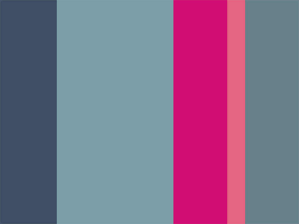
Notice how the proportions of colors in a palette start to suggest a way to apply this palette to an outfit: garments in smoky blues with a pop of fuchsia in accessories, for example.
First things first. Let’s define a color palette. For me, the term palette means a group of colors that are intended to be used together. Palettes are often represented by a group of stripes, where each stripe signifies one color. Since our clothes and accessories are also intended to be used together (one item alone does not make an outfit), starting with a color palette makes sense. And guess what? You already have a palette, quite possible more than one, right there in your very own closet!
The trouble with palettes is that they’re theoretical. You have this palette that’s made up of a bunch of stripes, and this is supposed to somehow translate into a wardrobe? I’ll show you how to access the palette that already exists in your current wardrobe. Then we’ll use it as inspiration for entirely new ensembles.
Bonus: I’ll show you how to use a palette when shopping for fabric!
Creating a Customized Palette
Define your existing color palette.
Re-Order Your Closet by Color
After years of arranging my clothes by type (dresses, tops, pants, etc.), rearranging them into groups of colors was an absolute revelation. Who knew I had that many black clothes? (I’m not even particularly fond of wearing black, but I had a lot of things hanging on from my ballroom-dancing days.) And considering my favorite color is any shade of green, why is there so little of it in my wardrobe? As you make your own discoveries, jot them down, particularly any major surprises; these are the clues that will guide you toward your personal palettes.
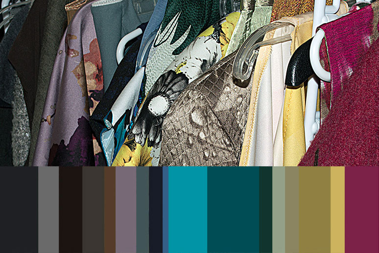
Above: Arranging clothing by color provides a lot of useful information about what you currently own; consider photographing your closet, as this can help you see your palette differently. Below: Translate the colors in your current wardrobe into a palette, making sure that every color is represented.
Create Your Palette
A visual record is important here, rather than a written list of colors. There are various ways to accomplish this. You can simply stand in your closet and draw stripes with crayons on a notepad. Here’s what I did here: I took a photo, opened it in Adobe Photoshop, and used the eyedropper tool to pull colors from the photo; each color fills a rectangular block drawn with the rectangular marquee tool. (See the Resources section at the bottom of this article for more options.)
You’ll notice my palette has thick and thin stripes. I’ve tried to keep the proportions of the colors the same as my clothes (sweaters, coats, and accessories were not included in the above photo). Ultimately, when you’re working with color palettes you’ll want to hone in on a simplified palette; rather than attempting to work with every single shade just get a sense of the main color groupings, which will be identified by the largest blocks of color.
Analyze Your Palette
What does my palette tell me? Well, clearly I prefer deeply saturated colors, and I also gravitate toward slightly strange shades, like the sort of greenish-bronze-gold and the smoky lavender; my favorite colors tend to be the ones I can’t easily name or define. And now that I’m looking at this palette, it looks like the whole right half is more intense, and the left half is a bit smokier and softer.
Take some time to look through your palette and see what patterns or commonalities stand out to you. Generally speaking, your colors may be bright, pale, clear, icy, smoky, natural, or neutral. Identifying their major characteristics now will lead you to the next step.
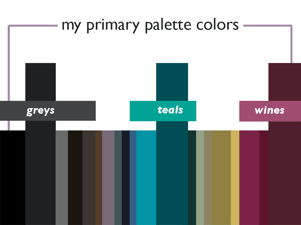
The three prominent colors in my palette are charcoal, teal,
and wine. These three together already make a beautiful palette,
with the jewel-toned teal and wine offset by the neutral charcoal.
Identify the Prominent Colors in Your Palette
While picking out the colors of your clothes, it’s easy to get distracted by prints and textures but try to distill it down into general color categories: blues, reds, browns, grays, etc. Then get a little more specific: teal or sky blue, wine or scarlet red, taupe or chocolate brown, charcoal or silver gray. You can either group things together on your clothes rack or (more fun) just dump them all on the floor and move them around into color categories. This should help you identify two or three main colors. These should also be the thickest stripes in your palette.
At this point, ask yourself: Do your main colors really feel like you? Ideally, your reaction will be, “Yes! These are my favorite colors!” If you’re hesitating, even a little bit, this is a good time to think about replacing one or more of your core wardrobe colors. Examine the skinny stripes in your palette—does one of those call out to you? Would you like to wear more color but find yourself defaulting to neutrals? Are there certain colors that are flattering to your skin tone that you’d like to wear more often?
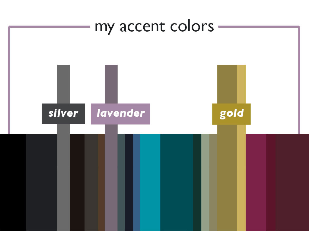
Not only do these accent colors work well with the rest of the palette,
they actually make an amazing palette when put together.
Color palettes can help focus your eye and highlight new possibilities.
Select Several Accent Colors for Your Palette
Accent colors are used for emphasis. Your accent colors should come from the skinny stripes in your palette—colors that you love but that only occur here and there. Keep in mind that accent colors can be used for accessories, so this is one way to incorporate colors that doesn’t go well with your skin tone. You can also use accent colors to experiment with the season’s it color. Notice if your accent colors tend to be clothes or accessories, and if you have any gaps (five scarves but no bags, all tops but no bottoms, etc.).
For my palette, I pulled out silver, smoky lavender, and gold (including that that greenish-bronze-gold I mentioned earlier). Notice how these hues, unlike my primary colors, are all soft and rather smoky, providing an unexpected counterpoint to the deep jewel tones that make up the prominent colors in my palette. Accent colors provide visual interest and depth, so choosing accents that have a different characteristic than your main colors can be one way to liven up an outfit.
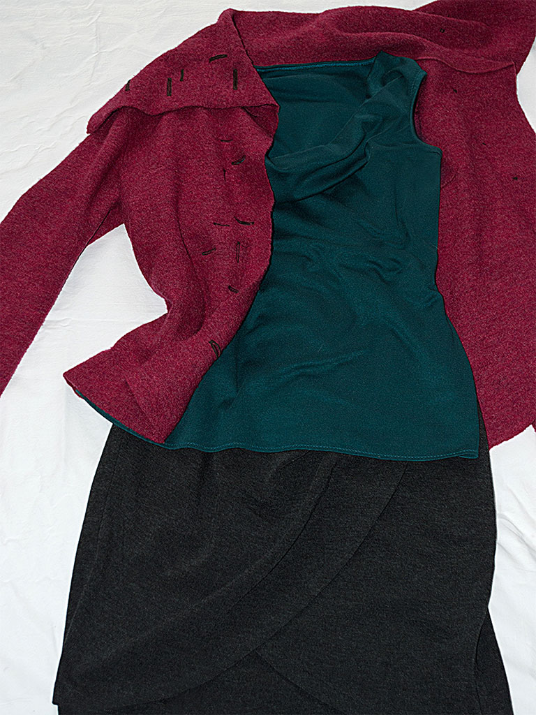
Although I love each of these colors (and garments)
separately, I never thought of wearing them together until
just now. Working with your prominent colors can help you hone in on
unexpected garment pairings that just might become your next
favorite outfit.
Creating Outfits from Your Color Palette
Put your new color palette to the test.
Make Use of Your Prominent Colors
Before you get too deep into swatching and project planning, take some time to create outfits with the clothes you already have. Pull garments in your palette’s prominent colors and test run a couple outfit combinations to see what you think.
Next, experiment with adding one or more accent colors to the outfit, just to see how this changes the look. Are there certain combinations you default to, and what happens when you push yourself to try a different accent pairing?
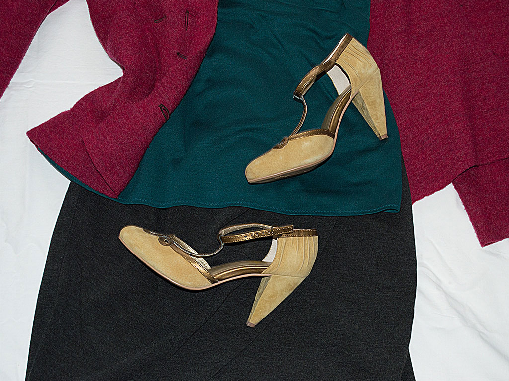
For my outfit, I grabbed a pair of gold shoes. This greenish-bronze-gold is one of my passions but it doesn’t look wonderful next to my face, so I use it mostly in accessories. Still, unusual colors sometimes make a stronger statement when used sparingly. Also notice how the gold lightens up the outfit.
Experiment with Variations
How are things looking? Are you enjoying the outfits you’ve come up with so far? If so, you might try riffing on these color combinations with a couple variations:
- Go from solid to print. This might lighten up the feel of the outfit, or give you the chance to experiment with accent colors in new ways.
- Try using your prominent colors in both garments and accessories
- Likewise, try incorporating accent colors into the outfit
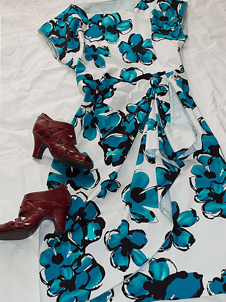
This is a more summery take on the teal, charcoal, and wine combination. You’ll notice that if I add some chunky gold jewelry, I’ll basically have the same color combination as my first outfit. Using a turquoise/charcoal/black/white print with a splash of wine, and mixing 1920s-style shoes with a 1950s silhouette, creates a completely different feel.
While you’re playing with new outfit ideas, pay attention—this is where you’ll start to notice gaps in your wardrobe. For example, maybe you have a lot of purple, but it’s mostly in solid-color knit tops; you could think about incorporating more purple (and derivatives like lavender, mauve, and plum) into other areas like a winter coat or accessories. And don’t forget that having bits of fun colors here and there in prints is a great way to experiment with hues you might otherwise hesitate to try.
As you move through these steps, you may find that your closet has more than just one palette. In fact, that’s what I want to happen! Once you’ve developed your primary palette, play around with others—you can create palettes for different seasons, travel, special events, and professional looks.
Color Palettes and Fabric Shopping
One of the main advantages to having clearly-defined palettes is that they help guide your buying decisions, particularly in fabric stores, where the sheer volume of choices can lead us down a dangerous path (I know you know what I mean). Keep your focus by carrying your palette with you! Just store a copy of it on your smartphone or tablet (you can email a copy to yourself) and you’ll always have it handy. When you’re in the fabric store, you can easily double check your purchases against the palette you’ve created for yourself. While you’re at it, also keep that list of clothing and accessory holes handy.
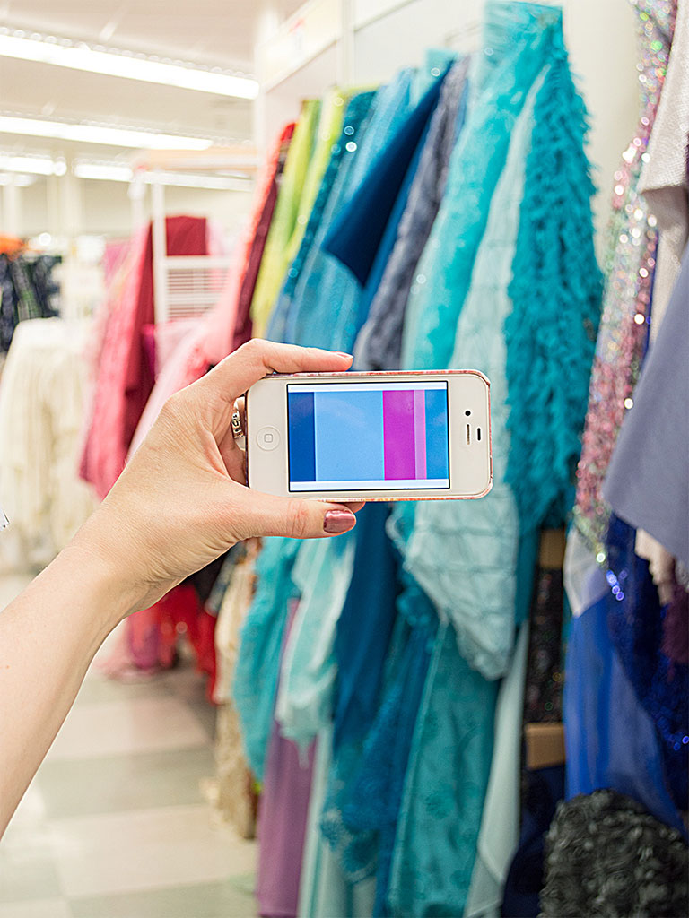
Recognize the colors in this palette? Each is a slightly different version of the colors that appear in the palette I created from my closet. Combining a limited range of hues, like these smoky blues with fuchsia accents, is yet another way to get more mileage out of your closet palette.
See? Your perfect wardrobe color palette already exists, right there in your closet! And now that you’re armed with that palette in your pocket, you’ll do your fabric shopping with a lot more confidence that your gorgeous garments-to-be will blend seamlessly into color-rich ensembles with the clothes you already have.
Resources
Generating a palette from a photo:
a. Adobe Photoshop (including Photoshop Elements) or Illustrator both have eyedropper tools that allow you to pick colors out of a photo (Photoshop tutorial and Illustrator tutorial;
b. This blog post offers details on how to generate a palette from a photo;
c. ColourLovers: Under Tools, scroll down to Copaso: This lets you import a photo, then pick colors directly from it to create your palette. After you’ve saved your palette, you can download it in various sizes and file formats to open in Photoshop, or to store on your smartphone (for easy access in fabric stores, don’t you know).Pantone goes way beyond Pantone’s well-known Color of the Year (or Colors, for 2016); you’ll find color trends predicted well into the future, insights into the psychology of colors, and much more. It’s well worth exploring.
ColourLovers is a fantastic resource for everything color-related, from color trends (for graphic design, fashion, weddings, and more) to millions of palettes you can use for inspiration. It’s one of my favorite places to hang out and create. Tip: If you want to find palette ideas for a specific color, run a search for that color; the results show palettes combining that color with others.

About the Author
Lindy Thibodaux is a color palette specialist and designer who lives, writes, sews, and plays at Colormusing in Portland, OR. Oh, and she maintains several blogs: check out A Musing for everything related to color palettes, My Bratelier for lingerie sewing, and Changing Your Clothes for sewing, refashioning, repairs, and alterations.