
 Sign In
When we wear colors that do not harmonize with our own personal coloring, our faces can disappear and our clothes can dominate. When that happens, you might ask yourself: Am I wearing my clothes or are they wearing me?
Developing a personal color palette allows you to sew clothes that always make you feel beautiful. Color then becomes an integral element in your design process that allows you to create garments that are a true reflection of your style and unique features.
Why develop a personal color palette?
Symptom
Solution
Your clothes don't always make you feel vibrant.
When wearing your own colors, you naturally will feel better. It’s hard not to feel blah in a deep, dark sweater when candied pastels light up your face.
You feel disconnected and trapped by fashion trends.
With a strong sense of your own colors, you won’t have to wait for fashion seasons to bring your favorite colors to you.
Your clothes don't seem to go well together.
You will increase the versatility of your wardrobe. When all your creations are in your color range, you can combine your clothes in ways that you never could before. Orphan garments will be a thing of the past.
You find yourself buying fabric because it's "close enough" to what you really want.
A personal palette will boost your creativity. Working within the limits of a color palette, you will look for novel solutions when you cannot find the right color in a given fabric. For example, when you can’t find the right shade of denim, you might reach for bleach, dye, or choose a vivid printed twill.
Design Your Own Palette
With a paint matching app, a couple of online resources, and free paint chips from a home improvement store, you can put together a collection of colors easily. Expect to refine your colors over time, but this method helps remove guess work, giving you a strong base to build from.
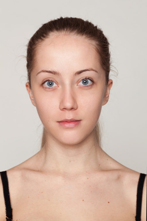
Begin by taking photos in natural light, with your face toward a window.
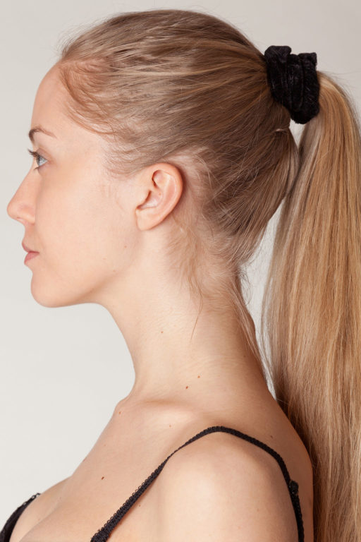
Take photos that also capture your hair and eye color.
First, take a picture in natural light of your face. Take another picture of just your eyes, and one more of just your hair. If necessary, you can adjust colors and light on your phone or computer to get closer to your actual color.
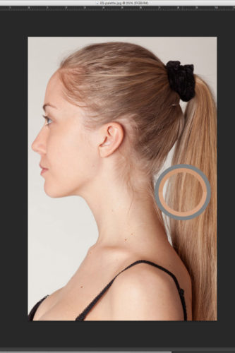
Use digital tools to determine the
RGB values of your skin, hair, and eyes.
Once you have your digital photos, you will need to determine the RGB values of your skin, hair, and eye colors. To do this on your phone, use a paint matching application like Color Snap by Sherwin-Williams. On your computer, use a graphics editing program such as Adobe Photoshop. Open the photo of your face and select the color of your skin using your chosen application's color selection tools. This will give you your skin color's RGB value. Repeat these steps for your eye color and your hair color.
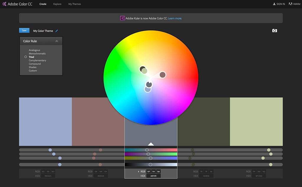
Next, you can use free online tools from Adobe Color CC to create an initial palette. Enter the RGB values into the “base color” of Adobe Color CC. This site will give you 24 complementary, analogous, triadic, monochromatic, compound colors, and shades to go with your base color. Write down the RGB values for each of the colors, creating complete sets of color based on your skin, hair, and eyes.
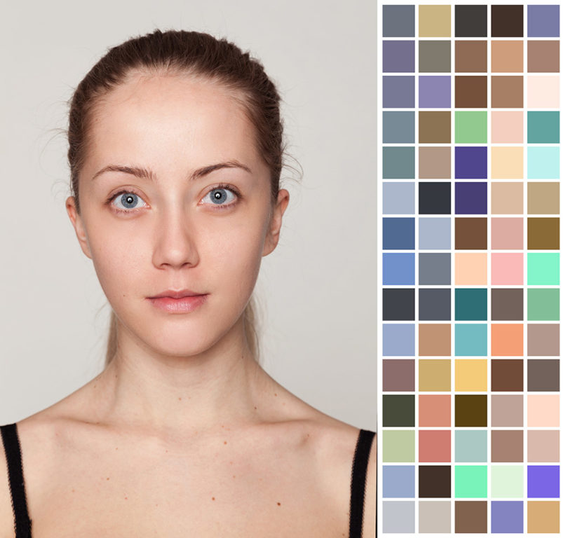
Once you've found your initial palette, you may want to edit out colors that are very similar to one another.
Once you have this set of color, use the tools at the Easy RGB website to find matching paint colors. Click the “from RGB to commercial tints” link and you will be able to match RGB values to paint colors from many different brands. When you get your paint chips, you can use any brand available to you. Choose the paint color closest to the RGB values from the four choices given, writing down the paint number.
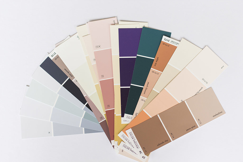
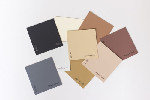
Collect paint swatches to create a physical version of your palette.
This process gives you a comprehensive palette with all the colors of the spectrum plus neutrals. If it seems that you’re lacking in one particular color, grab a couple of extra paint chips near the color you feel you need so you can test them.
Test and Refine Your Colors
Next, test all of the paint chips against your face in natural light with no makeup. A color flatters you if it makes you look radiant without the added help of makeup. If your skin softens, imperfections are minimized, your eyes sparkle, and your hair looks healthy, you have found a good color for yourself. Check to see if the whites in your collection match the white from your teeth color and the whites of your eyes. These whites in your own physical makeup are probably not perfect bleach white and probably softened to some degree.
As you test your paint chips, you might find that you need to adjust the colors slightly due to imperfections in the lighting or camera. Look for new chips one or two steps away from your computer generated colors on the paint chip display if the colors seem off to you.
Contrast also plays a large role in finding flattering colors. Your overall contrast is the difference between your darkest and lightest features, including hair, skin, and eyes. Those with light eye color, light skin, and light hair are low contrast. People with dark eyes and hair and light skin are high contrast. Those with a medium skin tone are often medium contrast. People with low contrast tend to look better in more subdued, harmonious palettes. This is because dark, bold, or high contrast prints will tend to jar the eye and draw it away from the person and towards the clothes. Those with high contrast can carry off dark or bold colors, while muted tones may not play up your features as well.
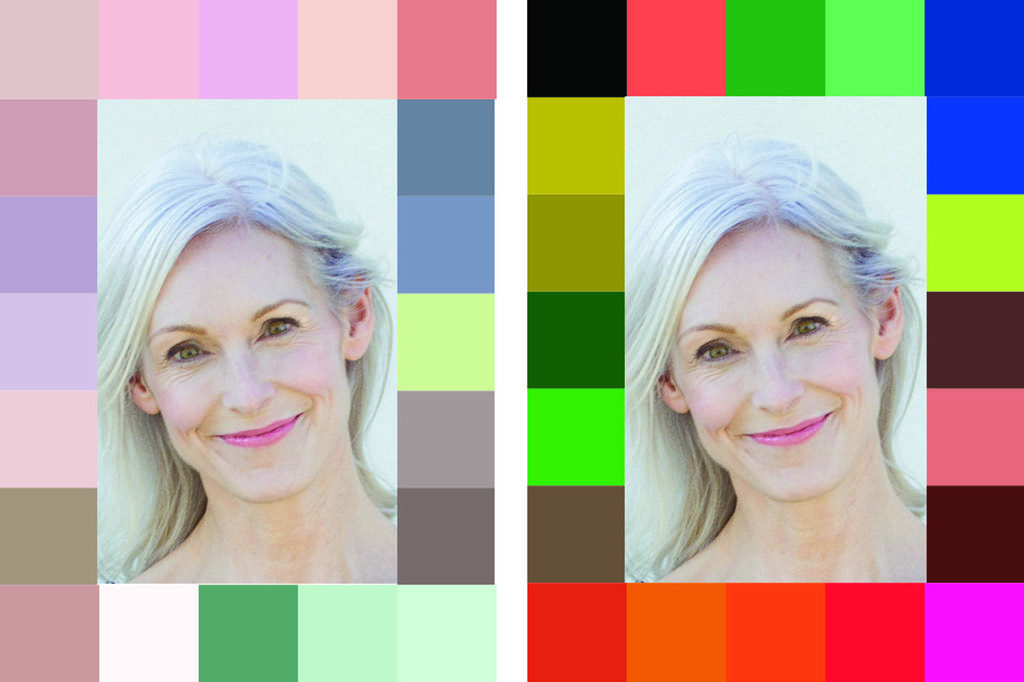
A light complexion and light hair and eyes makes for a low contrast. People with low contrast are overwhelmed by high contrast colors (right), whereas muted colors draw attention to the face (left).
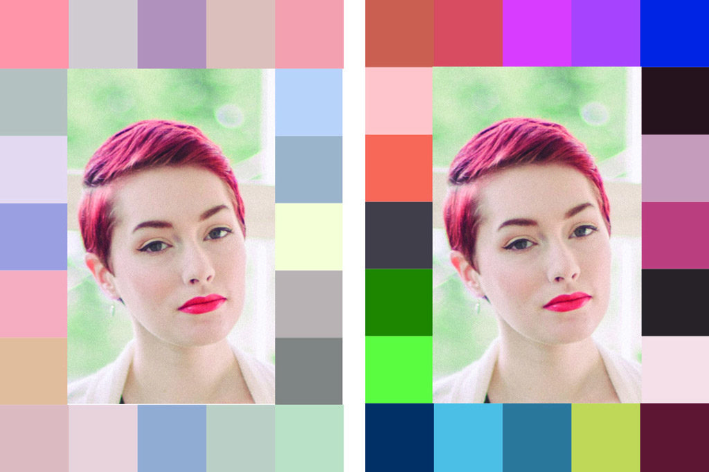
Greater difference between skin, hair, and eyes makes for high contrast. These types look great in high contrast colors and prints, which bring out the contrast in the face.
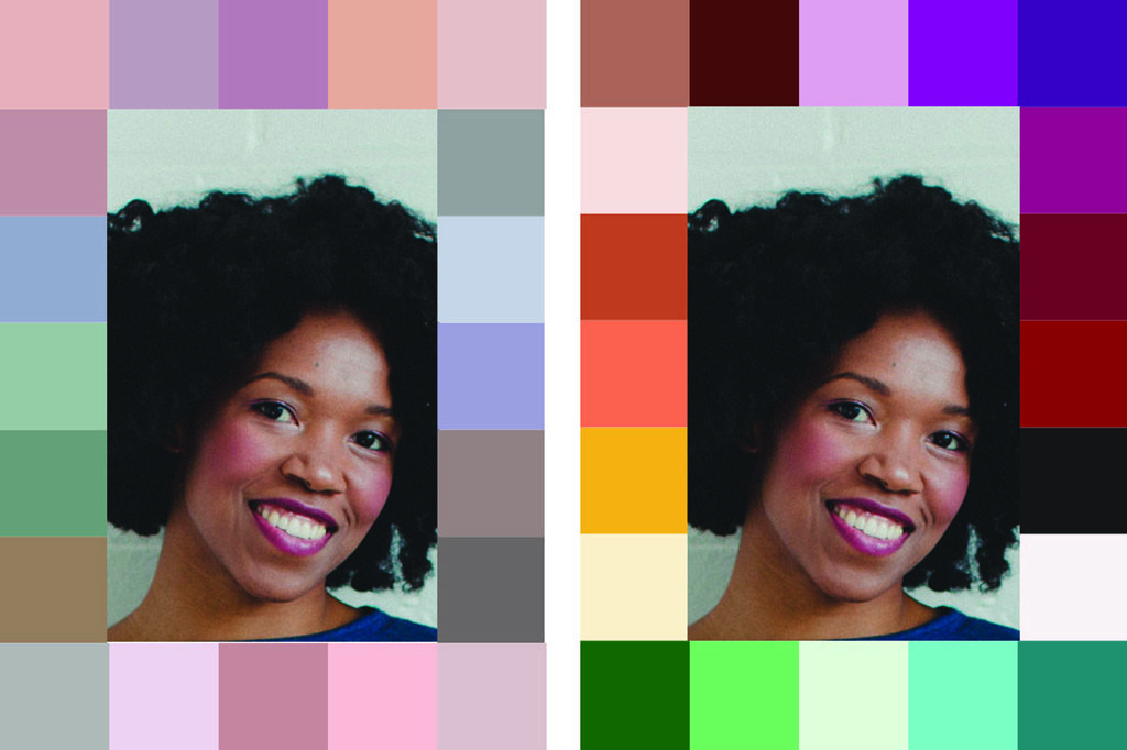
Darker skin tones should follow the guidelines for high contrast, contrasting skin color with clothing to draw attention towards the face.
If you have a dark skin tone, you can usually consider yourself high contrast. Though dark skin is often accompanied by dark hair and eyes, which may lead you to think of it as low contrast, the effect is very different from light skin and light hair. Bold colors and high contrast palettes are striking against dark skin and hair.
You can determine your own contrast by taking a picture of yourself and converting it to a black and white image in your computer. Comparing your picture to a gray scale or a color evaluator (used by quilters), you can easily see how much difference there is between your darkest feature and your lightest. If you are dark-skinned, take the portrait with a white background and compare the value of your features to that. You can replicate that same level of contrast in your own palette.
Get professional help
For surefire results and guidance, find a professional color consultant. There are several different systems of personal color analysis out there. The actual names of systems can be confusing since consultants are largely independent and old companies have renamed themselves – sometimes multiple times.
Some systems classify you by seasons, and some evaluate you individually. Early seasonal color classifications in the 1980s included the four seasons: spring, summer, winter, and fall. Today, many consultants use an expanded version of twelve or even sixteen different variations on these seasons.
The Sci/ART and Color Alliance systems are examples of systems that classify you by seasons based on color patterns in nature. After comparing you to 1600 colors, Sci/Art identifies you as one of twelve seasons. You then receive a premade fan that contains 65-70 colors, and the consultant teaches you how to use the fan.
Color Alliance identifies you as one of four seasons. Each season is broken into 15-30 subseasons, and you are also given another label to describe your overall personal contrast. Color Alliance consultants enter your hair, eye, and skin color into a program that will yield a unique palette of your best 40 shades. Color Alliance fans may even identify lipstick and blush colors as well as group colors for professional, formal, and casual wear.
Another type of analysis compares you against up to 2,000 swatches. This system does not have a brand name, but if you search for “2,000 swatch color analysis”, you can find a consultant using this method. The Association of Image Consultants International also has a good search feature on their site. Your fan containing 60-70+ colors will be completely unique and made from fabric swatches (as opposed to precision printed paper such as that of a Pantone deck), which is a huge advantage for sewists, allowing for fabric to fabric comparisons while shopping. These color analysts will often offer support in how to use your palette and maybe even a style workshop to help you understand how your palette will work in practical life.
Evaluate potential color consultants by their portfolios or by talking to their other clients. Make sure your consultant will be evaluating you without any makeup in natural, neutral light or light that specifically mimics natural light.
Consultations can be costly. I paid $195 a couple of years ago, but it has well paid for itself. I have saved money by buying fabrics that look the best on me and not wasting it on uncomplimentary fabrics.
Consultations can also be done via photographs or online. This can be less expensive, but you will lose the benefit of having a consultant see how colors change against your face in real time and real light. Because cameras and computer screens can both distort color balance, this can have a tremendous effect on your final color choices.
Building a wardrobe
As you build your wardrobe from your palette, focus on your neutral colors first, then solids, and lastly, prints. Your neutrals will pair with all of the other colors in your palette and will go out of style less frequently. Invest in good quality neutral fabrics, and the garments that you make from them will be around for a long time to keep your wardrobe versatile.
Build a wardrobe beginning with neutrals.
After neutrals, a good base of solid colors in your non-neutral colors is a good place to focus your attention. Add interest to your solid color garments with sequins, embroidery, or design elements like asymmetry. Prints will be the hardest fabrics to find in your colors, and finding a print that is 100% in your color range may be difficult. As you consider adding a print in your wardrobe, lay your color palette against it, step back five feet, and squint. At this distance, colors will start to blend. If the colors blend with your palette, it’s a good buy. If one or two colors seems to dominate your chosen colors, consider passing on the print.
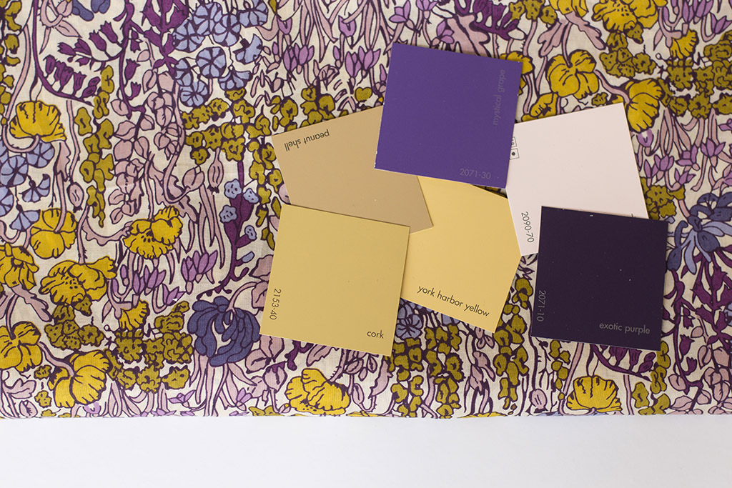
Evaluate prints against your color palette, standing back to examine how the colors blend.
Fabric shopping tips
Bring your color palette: If you have paid someone to do a color analysis, included in your consultation should be an organized swatch book. If you have chosen the do-it-yourself route, mount 1”x1” squares of the colors on strips of white archival cardstock with acid free glue. Order the strips in a way that makes sense to you, punch holes in the ends of the strips, and connect them with a ring. Alternatively, simply file your small squares into a plastic sleeved photo album. Now it will be easy to access your colors when you are shopping.
Get a Pantone guide: Several fabric stores online such as Emma One Sock, Gorgeous Fabrics, and Elliott Berman display the Pantone color codes for their fabrics. If you own a Pantone color deck, it will help you compare the Pantone numbers listed in the fabric descriptions to your own colors. This is an optional item, and it would seem that Pantone is no longer producing the very affordable “Shopping color guide” fan deck. You may still be able to find used copies online.
Create words or phrases that describe your palette: After you have your color palette assembled, look at them as a whole and see if you can come up with a few words to describe them. Maybe your colors are bold, bright, and cool. Maybe someone else’s colors are soft, muted, and warm. These words can help you narrow down a sea of fabric choices quickly.
Use a mirror and get swatches: If you’re in a store with a mirror next to a window, drape the fabric on you or test it against your palette to get an accurate view of the lighting. Get swatches. Even if you pay for swatches, a small investment for a swatch will outweigh the potential cost of buying yards of an unflattering fabric. When buying online where colors can be skewed, swatches can make or break a fabric purchase.
Be prepared to buy off season: Colors in fashion are cyclical, so there will be seasons that you are able to find a ton of choices in your color palette and others where you might find little in your colors. Be ready to buy the fabrics you want whenever you see them, whether they are in season or not.
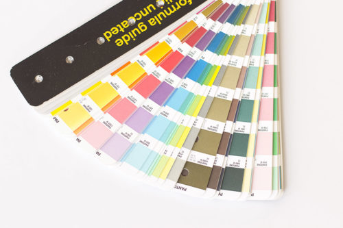
A Pantone guide can be a good investment if you purchase from
online shops that list their fabrics' pantone colors.
You will also need to think about fabric sheen and texture. Some fabrics, such as satin, reflect light and can appear brighter or lighter depending on the surrounding light. Other fabrics are matte and tend to absorb light for a duller look. Even if a fabric color is a good choice in theory, the light could change its appearance enough to make it less than optimal.
Using colors outside your palette
Straying from your palette
Colors that don't fit your color scheme can still be used for:
- Shoes
- Buttons
- Linings
- Trims
- Belts
- Jewelry
Even if a color is "wrong" for you, there are ways to use it. If you hear the siren call over a dashing wool tweed or luscious silk that’s not your personal best choice, don’t pass it up. Make it up into a unique piece in your wardrobe and use your palette colors to balance its effect. If you make a shift dress out of a gorgeous, but wrong-for-you floral brocade, wear it with a jacket or cardigan that is in your colors. Your topper will be closer to your face than the dress and will help minimize any harsh shadows cast by the brocade.
You can also love your "bad" colors by using them in your house. If you can’t live without with that funky vintage barkcloth in that shade of grey that looks positively ghastly on you, let your windows wear it in all of its retro glory.
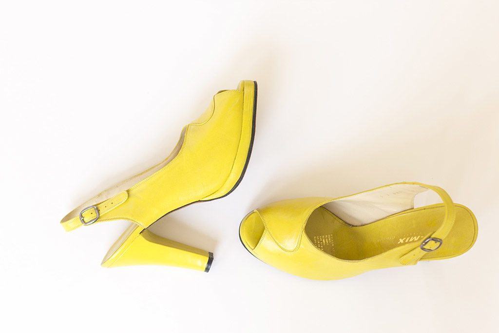
Colors that are hard to wear near the face can be perfect for accessories such as shoes.
As you use your new color palette, there will be an adjustment period as you retrain your eye to find your colors. At first, you might even mourn the loss of some of your old favorites. But the benefits of defining your palette far outweigh these new constraints. You'll begin to feel more confident in what you wear and more focused in your spending. You'll be able to make clear-headed decisions based on what really works for you, not just what's trendy. You will feel empowered to look your best in your own creations. At the end of the day, isn’t that why we all sew?
Resources
-
Association of Image Consultants International: Find a color consultant -
Christine Scaman: 12 Blueprints: Christine trains color analysts and writes this excellent blog helping people define their color palettes. A directory of color analysts trained in her system can be found here. -
Color Revival by Lora Alexander: a book explaining 12 and 16 season color analysis -
Understanding Your Color by Kathryn Kalisz: a guide to the theory of personal color analysis written by the late artist, master colorist, and the CEO of Sci/ART. -
Pantone: more color inspiration and tools than you can imagine -
Ultimate 3 in 1 Color Tool and Studio Color Wheel: A helpful set of color cards that includes hex, RGB, and CMYK color formulas. -
Ruby beholder: a clear red view finder used in quilting to help balance light and dark colors. -
Color evaluator II: These red and green filters can be used with either warm colors (red) or cool colors (green) to evaluate color values of light and dark.
[END SIDEBAR]

About the Author
With an MFA in Music Education, Elizabeth Farr sews what she imagines while listening to Verdi. She catalogs her sewing process and learning at elizabethmadethis.com.

