Sign In
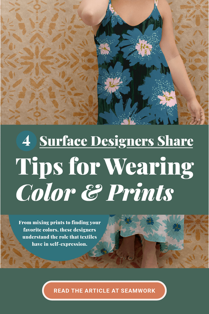
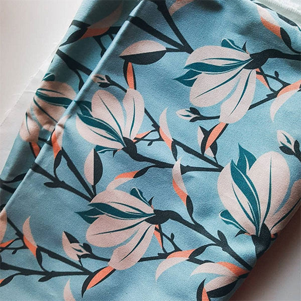
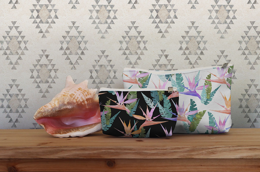
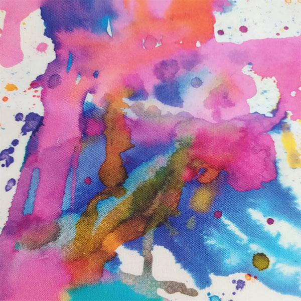
You know that feeling when you spot a bolt of fabric that has your ideal print, one with the best balance of colors and shapes for your style? It's fun to look at a fabric and wonder who designed it—someone took the time to sketch it out and pick all the final colors.
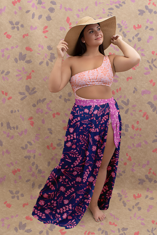
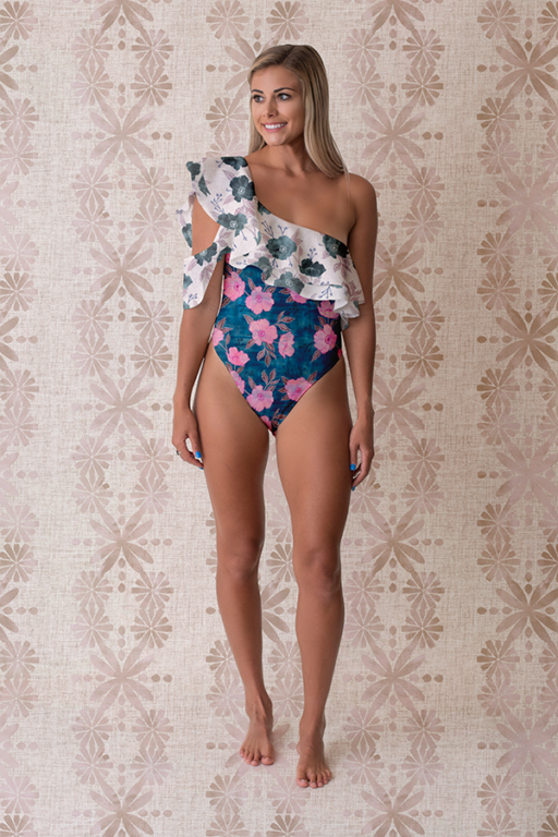
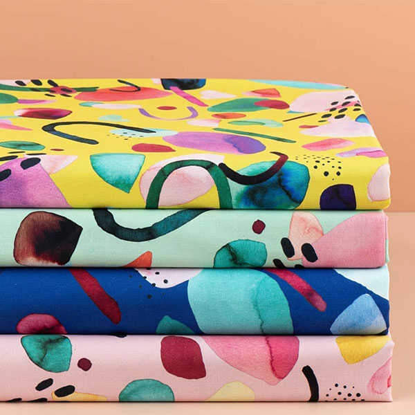
Meet four illustrators who create surface designs for Spoonflower! These designers all have backgrounds in the fashion industry, so they understand the role that textiles have in self-expression. In a series of interviews below, these artists share how they create their designs and give you tips for bringing more prints and color into your wardrobe.
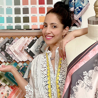
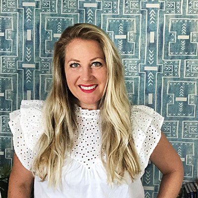
Nelvis Valenzuela
Nelvis is a former fashion designer turned surface pattern designer and illustrator with a passion for color. She describes her designs as expressing feel-good nostalgia. After working for 17 years in the fashion industry, primarily in intimate apparel (including work for Victoria's Secret), Nelvis now creates surface designs and illustrations.
What led you to surface design?
Nelvis: I started my career in the corporate world as an intimate apparel and sleepwear fashion designer. I was always sketching, selecting trims, fabrics, partnering with patternmakers. Almost ten years ago, I transitioned to color and print, working for a globally recognized company. That allowed me to expand my fashion experience beyond the garment design, and get to work on a different aspect. Aside from working with patterns in my day job, it's also my hobby. I'm very passionate about it.
Where do you get inspiration for your designs?
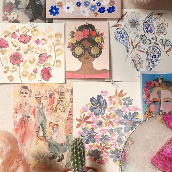
Nelvis: Inspiration comes from a wide range of things, but I think that the common thread between them all is history. I love to look at the intricate, decorative details in wallpapers and textiles from the late 19th to early 20th century. I admire the cover art in vintage novels. The creative imagination of children's storybooks is also something that gets my own creativity going. Lastly, I am also drawn to flowers and woodland critters.
What role does color play in your life outside of your work?
Nelvis: As a creative, I strongly react to colors during and outside of my work. Color is emotional; it's psychological. It affects our mood, the same way songs, scents, and foods do. I often find myself going down the rabbit hole of creating endless pattern colorways. The colors that I choose for my personal designs or my home reflect my personality and mindset. At home, outside of work, colors are very chill. My rooms range from warm earthy terra-cotta to calm dusty blues, and some walls have a light hint of yellow. It gives a calm and happy vibe, just how I try to keep my mindset and mood.
Color is emotional; it's psychological. It affects our mood, the same way songs, scents, and foods do.
- Nelvis Valenzuela.
What do you do when you get stuck while trying to design?
Nelvis: I go to my vintage inspiration boards on Pinterest, or I simply just walk away from the task for a while. Ideas can come to me at any given moment. When stuck, I become observant, and I take photos or notes of anything that sparks interest. If I rush to design, the end result is never one that I feel 100% pleased with. I've practiced controlling my pace, and I now take my time with my own personal work.
Do you ever think specifically of clothing when you design your patterns for Spoonflower?
Nelvis: When I design surface patterns, I always think about the end product. Fashion is usually the first that I cater my designs to, followed by wallpaper, bed linens, and accessories. I like to be strategic and analytical, so I prefer to create full surface pattern collections. Collections allow me to tell a story while also providing the customer with coordinates to mix and match or print mix. There is always a “key print" supported by patterns that are commercial and less complex. It's great to offer some gender-neutral, season-less, classic patterns.
How do you know if a color or print will feel good to wear?
Nelvis: Great question! I love patterns with good color harmony. I love whimsical illustrative patterns (a.k.a Conversationals) Those are always smile-provoking. If I'm smiling when I see it on a product, I'll probably buy it. Color and print definitely influence an emotional purchase.
If the style is merchandised with coordinating items or accessories, it makes me want to do a happy dance. There is less to figure out, and you'll know that the pieces look cohesive when worn together. Learn which patterns and colors enhance your already beautiful physical characteristics. Figure out what works for your shape, what areas you want to bring attention to or divert attention from.
Do you have any tips for anyone looking to bring more prints and colors into their wardrobes?
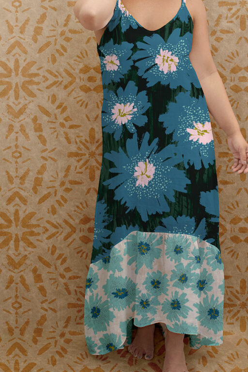
Nelvis: I have many. Think about the silhouette in relation to the scale of the print. Smaller scales tend to work best on small pattern pieces and vice versa. For styles with lots of fabric coverage on the body, choose simple prints that either have enough open space in the background or tonal colors so it won't feel like too much when worn. Next, choose colors and patterns that bring you joy. Lastly, bring some fun to garments by using contrast colors as accents for a fun pop. Try accent colors as binding, piping, covered bottoms, cuffs, hems, straps, lace-up and more.
Do you have any tips for mixing and matching prints?
Nelvis: I love a good print mix. That's one reason why I design surface pattern collections. Mix and match patterns that complement each other in one of these two ways. Mix prints with different patterns and scales but that stay within the same color palette. If you want to mix prints that use completely different colors, I'd suggest ensuring that the print patterns and scale are similar. There really isn't any official rule to follow when print mixing. You have creative freedom, but those were just my personal guidelines.
Website
Instagram
Spoonflower shop

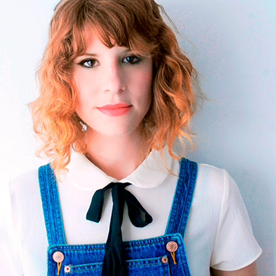
Janine Lecour
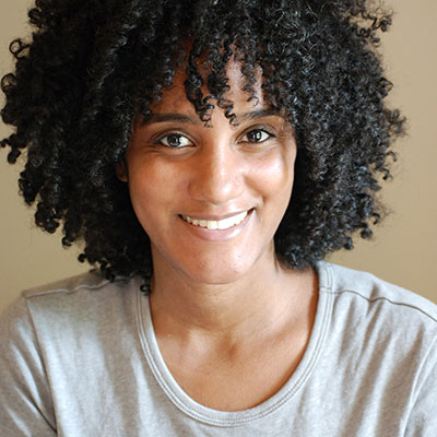
Janine is a freelance surface pattern designer from Atlanta who studied at the Savannah College of Art and Design. She creates bright, lively prints and has designed for a luxury scarf brand, Juma studio, Printed Village, and Anthropologie.
What led you to surface design?
Janine: I studied fashion design at Savannah College of Art and Design. Once I completed college, I was looking for where I fit in the fashion industry. I started to experiment with creating digital art and fell in love with the process.
Where do you get inspiration for your designs?
Janine: Color is a big inspiration for me most of the time. I'll start with a color or color palette and design a print around that.
What role does color play in your life outside of your work?
Janine: Although I love very vibrant colors, I don't wear or live in a particularly bright, colorful space. But I do like to have pops of color in my wardrobe.
What do you do when you get stuck while trying to design?
Janine: When that happens, I stop working on the design and move on to something else. Usually, that helps to figure out what isn't working on the design.
Do you ever think specifically of clothing when you design your patterns for Spoonflower?
Janine: Sometimes I do. For example, I know that a lot of my tropical designs work well in swimwear and activewear. Having a background in fashion design helps a lot when thinking about designing for certain markets.
How do you know if a color or print will feel good to wear?
Janine: I think it all depends on what you like and feel comfortable wearing. My favorite thing about wearing prints is how fun it feels. You can use them to reflect your mood and personality that day.
Do you have any tips for mixing and matching prints?
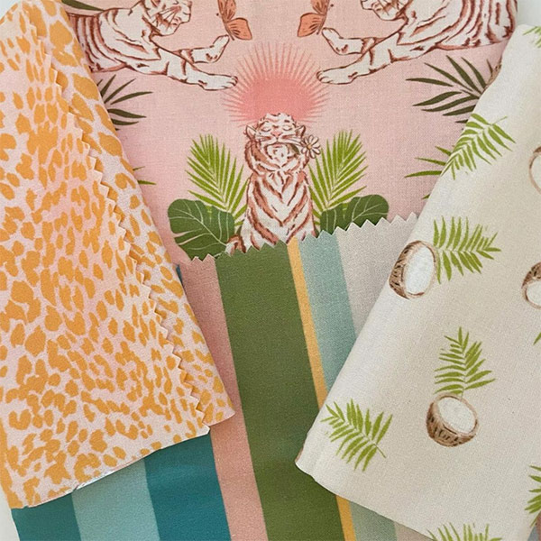
Janine: There are a couple of things to keep in mind when print mixing. Try to use prints that have at least 2 or more colors in common. Think about the scale of the prints. If there is a large, more complex design, pair it with a simple, smaller-scaled print. You can also mix organic prints with geometric ones.
Website
Instagram
Spoonflower Shop
Schatzi Brown
Schatzi is a New York-based textile and graphic designer and a self-described beach bum who studied textile design at FIT. Her designs are known for their vibrant colors, featured at Urban Outfitters, Nordstrom, and Target Online.
What led you to surface design?
Schatzi: I originally went to FIT for surface design, and after a year in the industry, I left to become a teacher. After teaching for about 15 years, I missed designing and was always drawn back to patterns in particular. I started to re-educate myself in the current design software, and when I had my first child, I left teaching and started doing freelance surface design work. One thing led to another, and I ended up creating my own Indie Yoga/Surf brand that I sell on Etsy (Nalu Tribe). When I had my second child, I was just home designing with so much work I decided to start offering my designs on Spoonflower for other makers.
What role does color play in your life, outside of your work?
Schatzi: Funny enough, I LOVE color so much, but I mostly dress in black or solids with pops of color all winter and switch out to brighter colors and patterns for the summer. In my home I love to keep neutrals on my walls and furniture so I can mix it up with patterns and color on my accessories and decor. My girl's room is decorated very girly, bright with rainbow patterns I designed for their bedding.
What do you do when you get stuck while trying to design?
Schatzi: Luckily, I usually have more ideas and inspiration for patterns than I have time to execute. When I do get stuck, it's usually in the editing phase or a technical issue , so I put it away and come back later or the next day and look at it with fresh eyes. I find that works well for a lot of creative endeavors.
How do you know if a color or print will feel good to wear?
Schatzi: The main thing I think about is, Does this print or color represent my personality? Does it speak for me without me saying a word? I love mixing prints for home decor but find it harder to mix for what I wear, so I prefer to go for a statement print or pops of color with solids.
Do you have tips for anyone looking to bring more prints and colors into their wardrobes?
Schatzi: My advice would be the same as what I ask myself. Does this print represent you without words and what you want to say about yourself?
Also, I think we all have a signature color palette, if you look through your closet, you start to see similar or the same colors repeated.
If you're hesitant to bring in prints, I think a good pair of black jeans can complement any crazy patterned shirt!
Website
Instagram
Spoonflower Shop
Laura Muñoz Estellés, Ninola Design
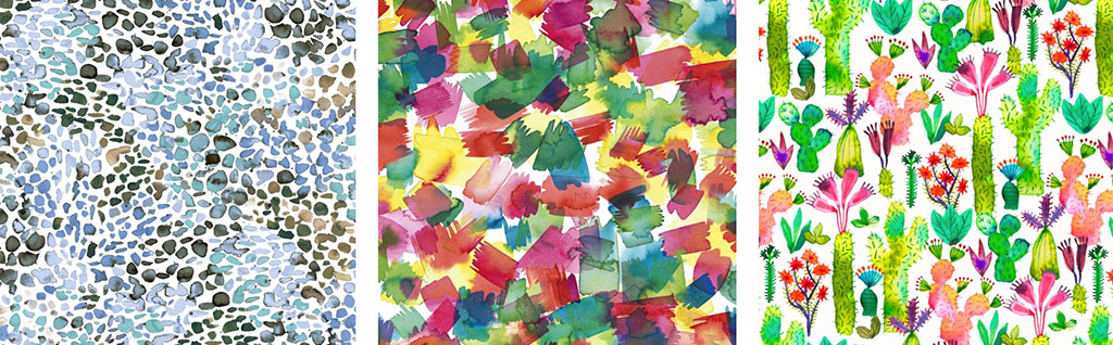
Laura of Ninola Design used to create designs for the fashion industry before specializing in textile design. She specializes in watercolors and hand-painted illustrations, and you'll now find many of her prints on textiles from indie clothing companies across the world!
What led you to surface design?
Laura: I have painted since I was a child. I have always been very imaginative and creative, I remember going to fabric department stores with my mum, I was fascinated by those fabrics, their patterns, and colors…When I had to choose what to study, I followed that vocation, and although it is not what I currently work as, pattern designer, I started studying fashion design and fine arts, then I did a master on Textile Design as my specialty. Textile design was a perfect midpoint between my two passions: painting and designing. I spent some years working for others and learnt a lot, but finally, I decided to work as an independent designer and opened my studio over eight years ago.
Where do you get inspiration for your designs?
Laura: As many other pattern designers, I'm a nature lover, I enjoy a lot painting flowers or leaves, trees, clouds, animals. I use it as my inspiration more often than not, but I also like to create abstract and geometric prints. I use this inspiration more as a starting point before letting my creativity and intuition do their thing.
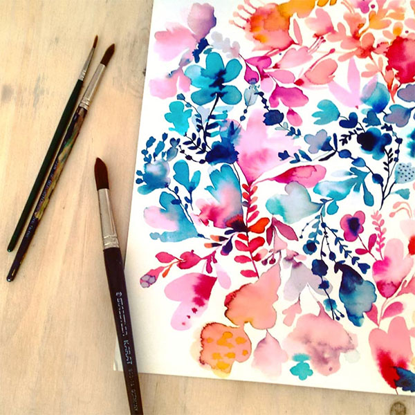
Other times, I like to paint without direct observation, just from something I remember, and with this method, I tend to get very original effects or shapes. I love to experiment, so when it comes to creating, the artistic aspect is very important to me. The majority of my patterns start with a watercolor painting, which I scan and work on digitally to convert it into an infinite pattern which can be printed onto fabric or any other surface. Sometimes people tell me that they are captivated by my use of color. I put a lot of happiness and enthusiasm into what I create, and I try to convey those feelings through color and prints.
What role does color play in your life outside of your work?
Laura: Color is very important to me. It makes me feel alive and happy. I use color in everything, at home, wearing clothes, or even cooking! To me, color evokes emotions, and living colorfully is about trying new things, finding new experiences, and approaching changes. I'm a very enthusiastic person, and without prejudices, color is a reflection of my personality, so let's live life colorfully!
Do you have any tips for mixing and matching prints?
Laura: I usually create collections of 3-5 prints with matching colors. First, choose a hero pattern, which is a more complex print than the others. Then you can combine this complex print with other simpler prints called coordinated prints, for example, a floral print or geometric print, or other prints related to the hero print but with fewer elements. But always you have to choose the prints from complex to simple in this order. The hero print should have more colors. Coordinated prints could have, for example, 2 or 3 colors from the hero pattern, but not all the colors.
I really like to mix flowers with geometric or abstract or textural prints, and try to find prints with a similar color palette, but it's not necessary that they have identical colors.