Fall is my favorite season to sew for, but every year I run into the same problem: too much inspiration and not enough focus. I'll gather photos, swatches, and pattern ideas until my moodboard is bursting, and then I freeze because everything feels exciting in the moment.
I've been sewing for nearly 30 years, and helping people build meaningful, custom wardrobes for the last 15. This fall, I tried something different. Instead of starting with a moodboard, I started with a palette, and it completely changed how I planned my season of sewing. Here's the palette, the four projects I'm making, and how you can choose colors you'll actually wear all season.
Start With Your Closet, Not the Moodboard
Every season, I gather inspiration the same way: Pinterest, pattern browsing, pulling fabric I'm drawn to. Normally, all of that goes straight onto a moodboard, and the vibe of the board tells me where to go from there.
This year, I had so much inspiration gathered that I couldn't settle on a direction. Everything was exciting in the moment, and honestly, that's the exact mistake I used to make constantly when I was starting out. I'd sew something because it thrilled me for a week, and then never wear it again.
So before I built the moodboard, I went to my closet instead.
Here's why that worked:
- I wanted to know what I actually reach for again and again, not just what excites me in the moment.
- My closet answered immediately. It's full of neutrals like black and ivory, plus a lot of warm brown and tan, several shades of berry red and burgundy, pink, and a ton of blue. Those are clearly the colors I feel like myself in, so that's where I started.
- Now, every fabric, pattern, and inspiration photo has to pass one test: does it work with this palette? If not, it gets set aside, no matter how much I love it in isolation.
The Palette: Navy, Burgundy, Shell Pink, Chocolate Brown, and Ivory
I already knew I wanted to make a pair of jeans this fall, so navy became my anchor color. From there, I played with swatches until I landed on a palette I was genuinely excited about: navy, burgundy, shell pink, chocolate brown, and ivory.
Once the palette existed, I wasn't deciding from scratch anymore. I was just checking things against it. That's the real shift for me this year, and it made building the rest of my plan so much easier.
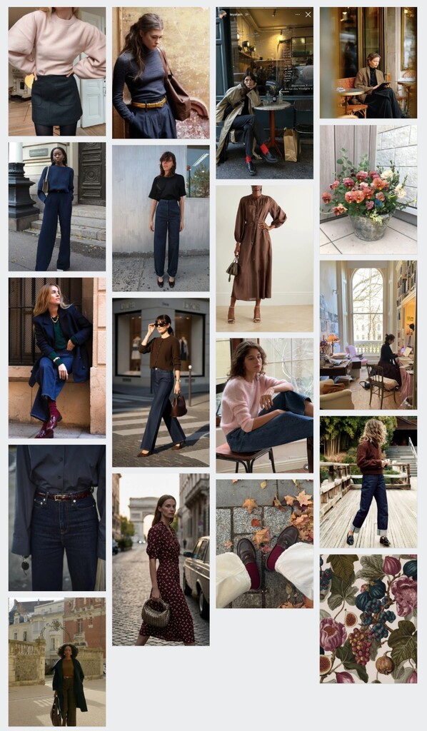
It's a warm palette with a little unexpected color in the pink, and every piece I make this season has to earn its spot by working with at least one of these five shades.
If you want to try this method for your own wardrobe, start by really looking at what's already in your closet. What do you reach for on repeat? Those colors are your foundation. Then pick one anchor color based on a project you're excited to make, and build outward from there.
Project 1: Selvage Noah Jeans
My first project is the Seamwork Noah, made into a pair of trouser-style jeans. This one had me a little nervous going in. Japanese selvage denim isn't cheap, and it only comes in narrow, 32-inch widths, so I had to order extra yardage just to be safe before I'd even cut into it.
I've wanted to make a pair of selvage jeans for years, the kind where the selvage edge runs right along the outseam as a design detail instead of disappearing into the seam allowance. Noah's straight leg is what makes that possible.
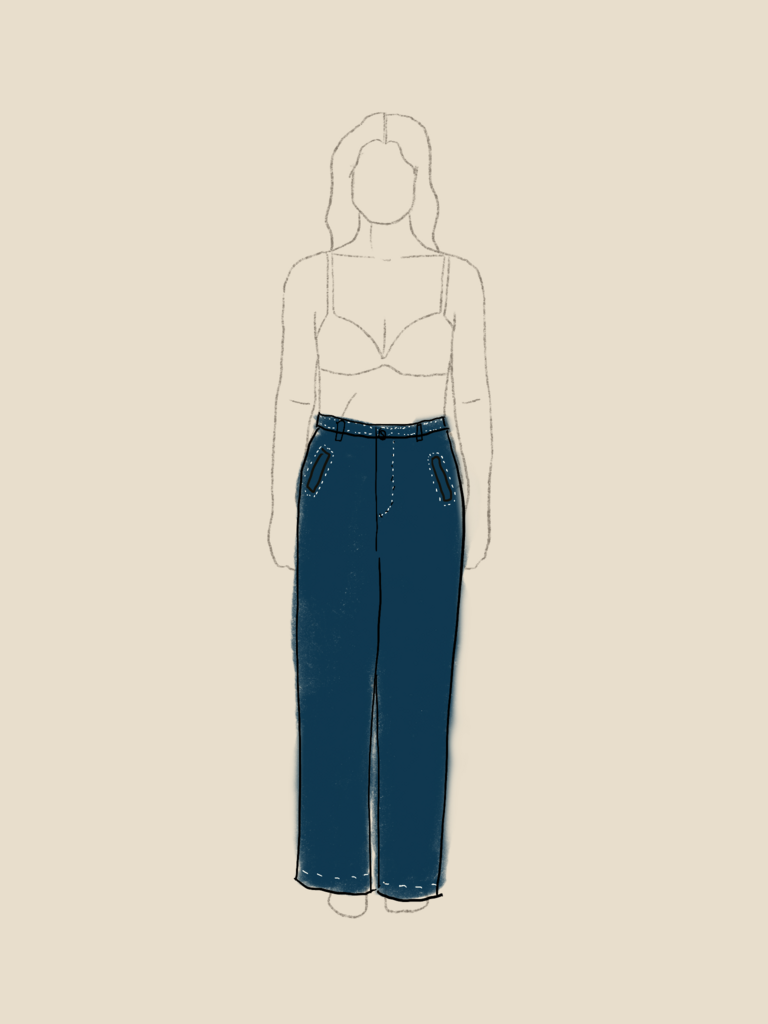
Here's the thing about selvage denim: it's got a decorative line running along the edge that's meant to be shown off when you cuff your jeans. But the second you cut a normal seam, that line disappears into the seam allowance. A straight-leg silhouette changes that. It lets the selvage line run right along the outseam as a visible design detail.
So if you're after that raw-denim look, your pattern choice matters just as much as your fabric choice.
The whole idea traces back to a recent trip to Paris. I was on the metro and saw a woman in wide-leg dark denim and a crisp white button-up, and I remember thinking, I need to make myself a great pair of jeans. I also noticed how much navy I kept seeing everywhere on that trip, which is part of why navy became the anchor color for this whole palette.
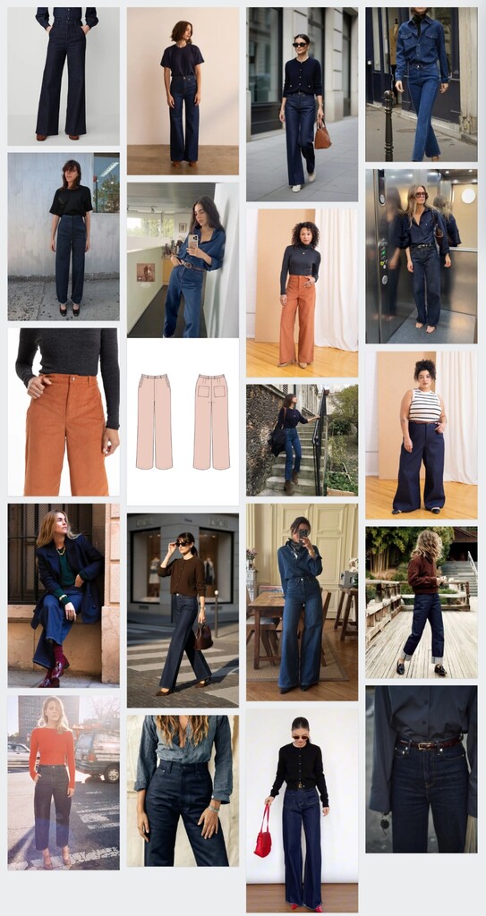
For fabric, I found a Japanese raw selvage denim from Yardblox with the most beautiful red selvage line. I'm picturing these jeans with a crisp white shirt, the way I saw them in Paris, or with the cropped Astoria sweater below, or layered under an embellished Thistle cardigan.
Project 2: Embellished Thistle Cardigan
Next up is another Thistle cardigan, but not one you've seen before.
Brown is a color I reach for constantly in fall, and a brown merino Fig cardigan I made last year is still one of my most-worn pieces from that whole season. I also loved an embellished Thistle cardigan I made for my Paris trip, and I wanted to bring that same feeling into this season's plan.
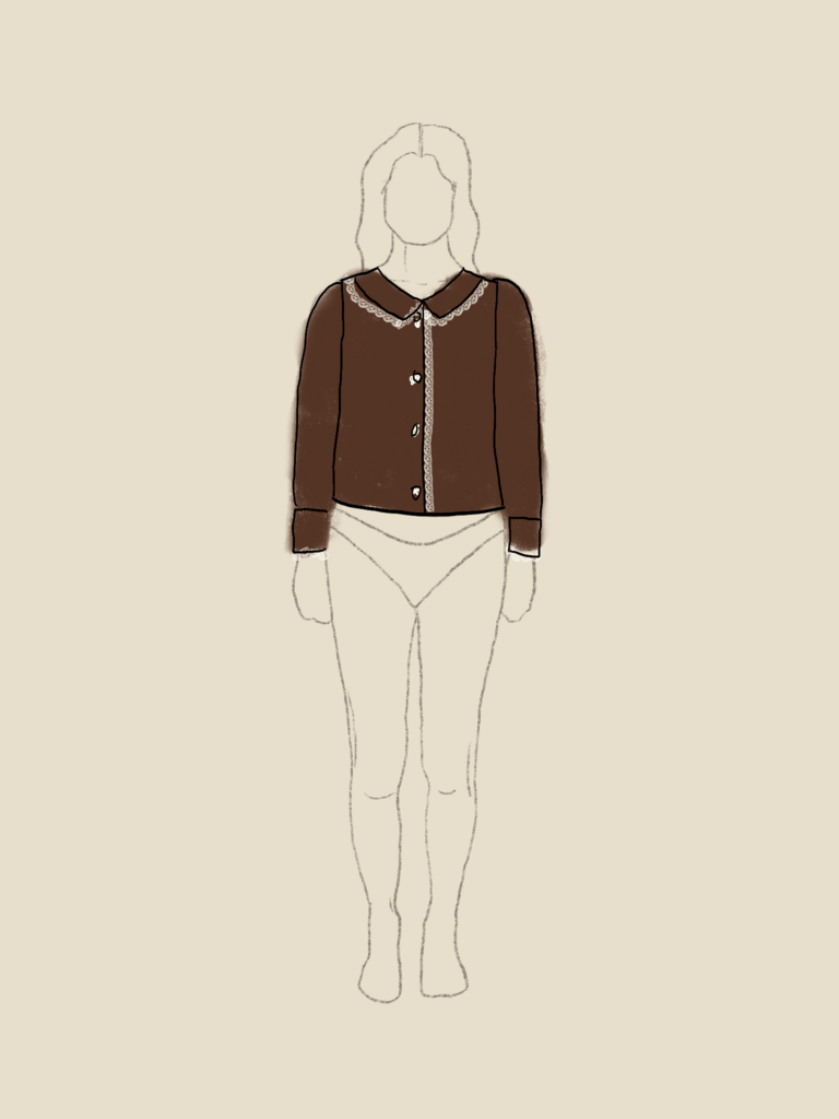
This time, instead of beading, I'm adding hand-crocheted trim along the edges. I'm still deciding whether to add pockets too, mostly so I have more real estate for trim. I've always wanted to make a project that combines sewing with knitting or crochet, so this is my chance.
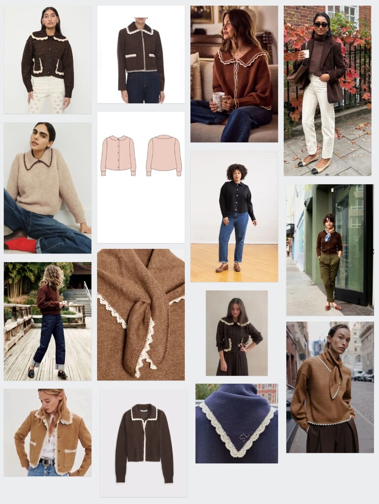
The fabric is an Italian double-sided sweater knit from Mood, in brown and salmon. Having two colors built right into one fabric means this single cardigan pulls in both my main brown and a hint of the pink from my palette. The salmon color will be on the inside, but it might peek out when the sweater is worn open, which will be such a cute detail.
I can already picture this layered over the Myrna dress below, over a simple tee, or with the Noah jeans I just mentioned.
Project 3: Burgundy Myrna Dress
Project three is the Colette Myrna, a dress I'd nearly forgotten about. Myrna is an older pattern, but I recently saw a member's version in the Seamwork community and remembered all over again how gorgeous that 1930s-inspired silhouette is.
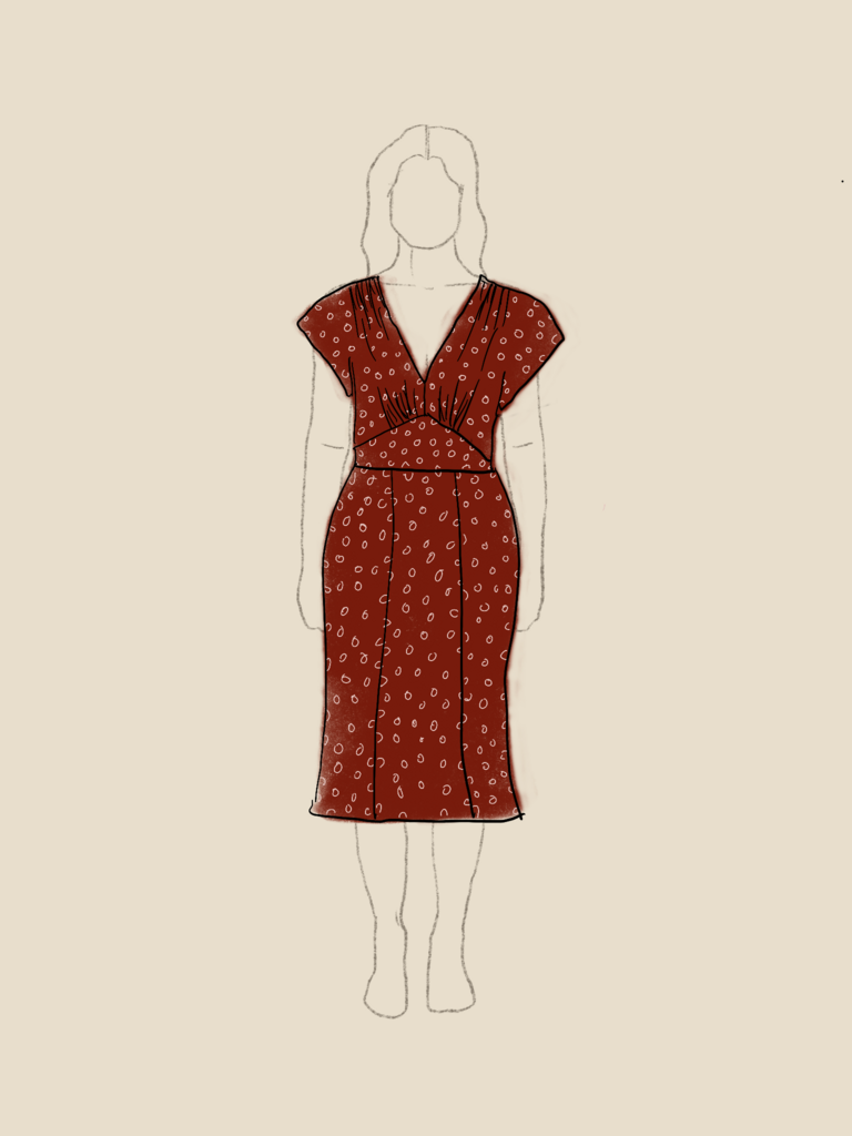
Burgundy and navy is a pairing I keep coming back to. It reads a little unexpected together, but I consider both of them basics, so they each go with almost everything else in this palette too.
I'm planning to wear this one to Stitchfest this fall, our annual in-person event here in Portland. Everyone always pulls out their best makes for it, and we have a little handmade fashion show at the end, which is my favorite part of the whole day. So I wanted to make something I was truly excited about.
The fabric is a burgundy viscose with ivory dots, from Yardblox. It has such a lovely vintage feel, and those ivory dots pull the last neutral in my palette right into the print.
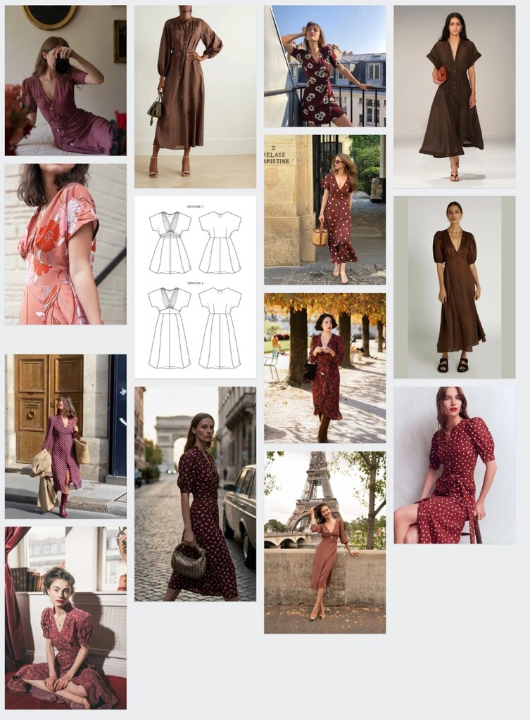
I plan to wear this dress on its own, with a cardigan layered over top if it's chilly, or with a more embellished cardigan when I want something polished.
Project 4: Cropped Astoria Sweater
Project four is the Seamwork Astoria, made into a cropped, cozy sweater. I'm still torn on one detail: I've collected some inspiration for a more billowy, dramatic sleeve, but I might keep it simple with the fitted version the pattern calls for instead.
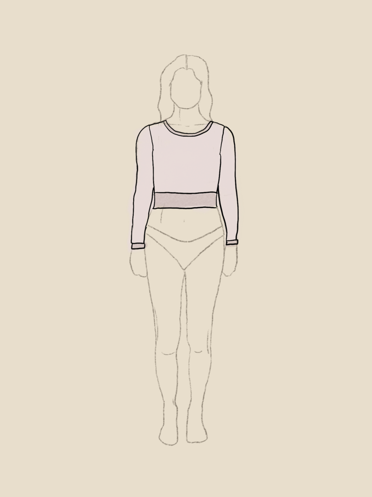
Pink is a signature color for me. I love it with navy, and I love it with deeper reds and burgundy, which made it an easy choice for this palette's accent color. It's a little unexpected for fall, but I like having one lighter color in the mix to soften everything else.
The fabric is a french terry with matching ribbing from Yardblox, a cotton blend that's perfect for something cropped and casual.
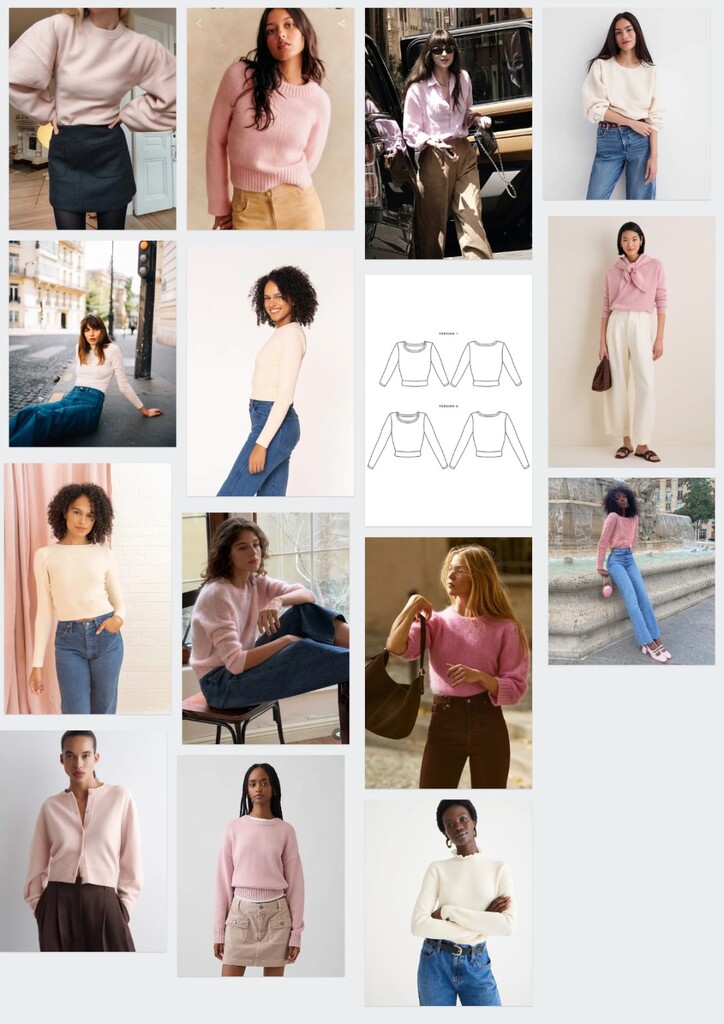
I can see myself wearing this over the Myrna dress, or with the new jeans, for something easy and cozy. The cropped silhouette makes it really easy to wear with all my favorite pants and skirts while still keeping some waist definition.
Leaving Room for a Wildcard
This is the plan, sketched out and mapped in my binder just like always. But I'm leaving room for one wildcard project this season too. Once I actually start sewing, something always catches my eye that wasn't part of the original plan, and rather than fight that, I've decided to leave space for it. A good plan should leave room to flex, and I'm giving myself that room this season.
What colors keep showing up again and again in your own closet, and would they surprise you if you turned them into an actual palette?
 Related Articles
 Best Articles