This fall, I built my entire handmade wardrobe around five colors: navy, burgundy, shell pink, chocolate brown, and ivory. I was about halfway through sewing it when I finally did something I'd wanted to do for years. I got my colors professionally analyzed.
It didn't go quite the way I expected.
If you're new here, I'm Sarai. I've been sewing for nearly 30 years, and for the last 15 I've been helping people build meaningful, custom wardrobes they love to wear. Color is one of the most powerful tools we have as sewists. Every time we buy fabric, we're making a color decision that will shape how a garment looks, feels, and fits into the rest of our closet.
So in this article, I'm walking you through my actual color analysis session: how it worked, what my results were, how my fall palette held up, and whether I think it's worth doing if you sew your own clothes.
Why I Finally Got My Colors Done
I've always been curious about color analysis. I'd watched videos about it and thought it would be fun to finally see how it played out for me. But I was especially curious about it as a sewist. I wanted to know if it could help me pick fabrics and think more intentionally about my wardrobe.
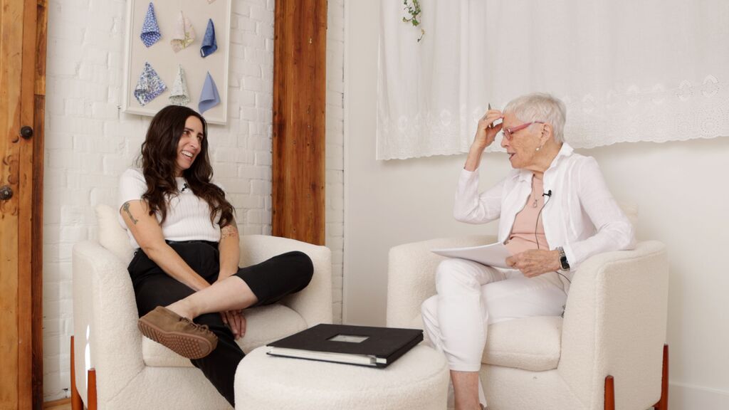
So I invited Joy, a color analyst here in Portland who runs ColorStylePDX, into the studio for a two-and-a-half-hour analysis session.
There was one thing that made the timing a little tricky, though. I'd already built a palette for my fall wardrobe, and I was halfway through sewing it. What if Joy told me my colors were all wrong? And what would that mean for the clothes already hanging in my closet?
If you read about my fall planning process, you know this season started differently for me. (Read this article to see how I planned my fall wardrobe.) Normally, I build a moodboard first and let its overall feeling guide where I go. But this time, I'd gathered so much inspiration that I couldn't settle on a direction.
So I went to my closet instead. I pulled out the colors I actually reach for again and again, and I built a five-color palette before I planned a single garment.
Since this season was already so focused on color, it felt like the perfect time to find out for real. I was excited, and maybe a little nervous, about what an analysis would say about a wardrobe I was already halfway through making.
I didn't just want to know what season I was. I wanted to know whether that answer would change anything about how I sew.
If you want to try building a palette like this yourself, seasonal or not, I put together the Fall Color Palette Workbook. It walks through the process I use to build a palette from scratch.
It Started With Personality, Not Swatches
This was the first surprise. The session didn't start with fabric or swatches at all.
Joy uses the Caygill method of color analysis. She begins with what she calls a personality and style assessment. Before she ever looks at your coloring, she wants to understand who you actually are.
First, she asked me why I wanted to do this now, as opposed to any other time. I told her it had been on my mind for a long time. I'd seen videos about color analysis and thought it would be fun to finally try it myself. I also explained that I was curious about it for sewing specifically. I wanted a better way to choose fabrics and think about my wardrobe as a whole.
Then she asked a much bigger question. What image did I want to convey? She didn't mean a style, like minimalist or romantic. She meant a feeling.
I found myself answering with words like competent, strong, and intelligent, along with a real enjoyment of life. (I also admitted to my long-standing habit of living in workwear and overalls, which probably tells you something too.)
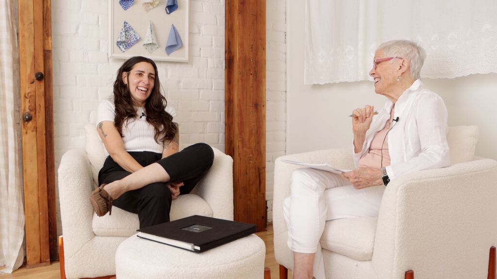
I loved that this was where the session began. It's easy to think of color as purely physical, all about skin, hair, and eyes. But the colors we wear say something about us, and it matters that they feel like us.
Finding My Colors: Warm, Cool, or Somewhere in Between
Next, we moved into the main part of the analysis: finding my actual colors.
Joy started by using a color wheel to explain color temperature. Colors can read as cool, warm, or neutral, and a big part of color analysis is figuring out which temperatures harmonize with your natural coloring.
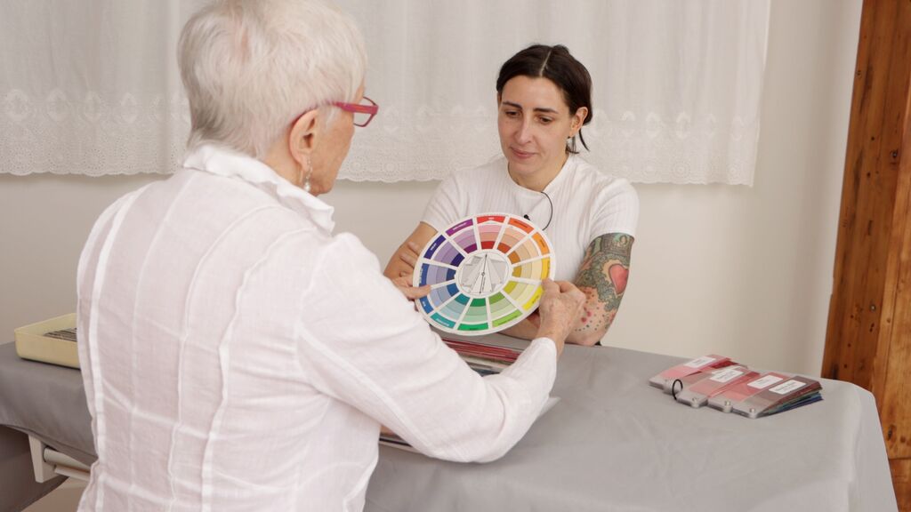
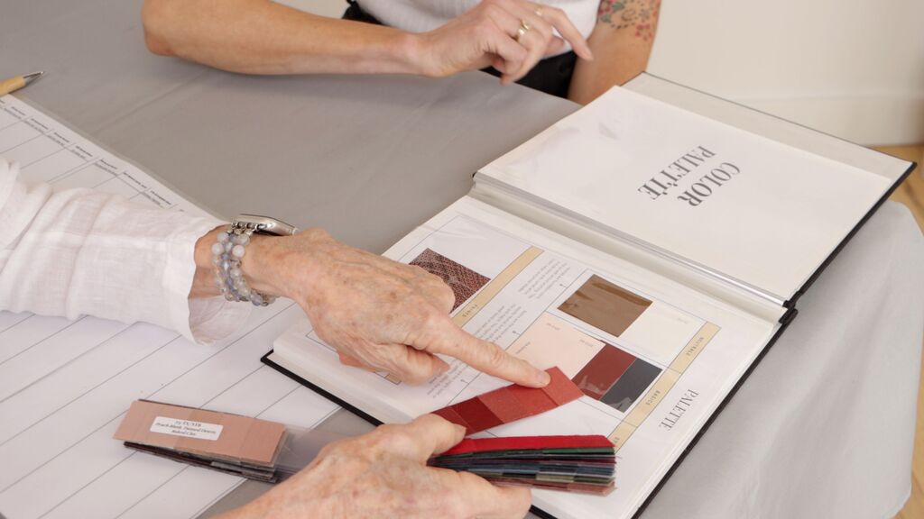
From there, she used season-specific palette swatch books as a starting point to identify which season I fall into.
Her first observation was that I'm high contrast. Then we went back and forth about whether I tan or burn, which is one of the clues that helps place you.
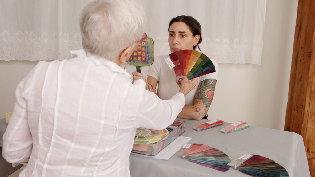
It turns out I was sending mixed signals. When Joy checked my skin tone against the swatches, she noticed that my ear read as a different color than my face. My face looked pinker. My ear and wrist looked more yellow or olive.
Joy explained that this is what makes some people hard to place. They have a genuine mix of warm, cool, and neutral tones, and she has to reconcile all of it into a single season. In the end, she went with the reading from my face. Her reasoning was very practical: my ear is hidden by my hair most of the time anyway.
My only theory? Sunscreen.
The Reveal
Because of my dark hair and relatively light skin, I'm pretty high contrast. Over the years, lots of people have told me they think I'm an autumn. So I assumed I'd land somewhere warm or bold. Maybe a Deep Autumn, or maybe a Winter, since I feel like I can go either warm or cool.
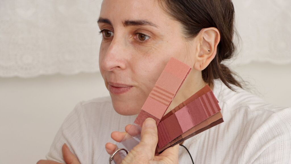
Then Joy revealed my core swatches and told me that everything in my palette would need to work with them, because, as she put it, "this is you."
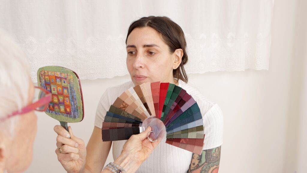
And the verdict was summer. A "Romantic Summer," to be exact.
That was not the answer I expected. Could I really have been a summer all this time?
Joy explained that my preference for quieter colors, rather than bold ones, was part of what pointed her toward summer. The saturated, powerful energy of a winter palette just wasn't me. Summer palettes are softer and more muted, and that fit the way I naturally gravitate toward color.
Along with my palette, Joy gave me a manual that walks through the whole thing. It explains how the colors are meant to work together and how to use them. For a sewist, this is gold, because fabric shopping is really just a long series of color decisions.
Testing My Makeup Against My Palette
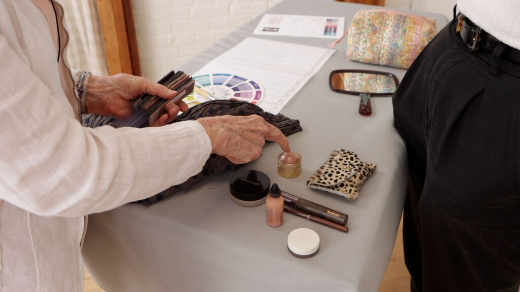
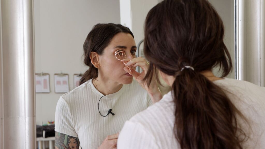
Part of the process also involved checking my makeup against my seasonal swatches. We looked at what I was wearing, figured out what worked and what didn't, and then reapplied with my palette in mind.
Some things were immediately obvious once they sat next to the swatches. One lipstick, for example, was simply too orange for me.
Putting My Fall Palette to the Test
Then came the part I'd been waiting for. We put my fall palette up against my seasonal colors.
I was ready to find out how my instincts had held up. Would my fall fabrics turn out to be too warm and autumnal? Or did they fit the muted look Joy had been describing?
I walked Joy through my moodboard and my five colors: ivory, chocolate brown, navy, burgundy, and pink. Along the way, she pointed out that one of them was a strong match for my eye color. I'll admit, that little "nice job" moment felt good.
What struck me was that I'd built this palette by paying attention to what I already reach for in my closet. Without knowing it, I'd already been drawn to a lot of the soft, quieter colors that suit me. That's a good reminder that your instincts about what you love to wear are worth trusting.
What About the Clothes I'd Already Sewn?
I'd also brought a couple of finished pieces from my fall capsule to test against the analysis.
The Noah Jeans
First up were my Noah jeans from my Paris trends project. (Read this article to see how I made them.) I'd made them with a very specific idea in mind, and I wanted to know if that idea held up.
They're sewn in raw denim with white topstitching, and a red selvedge detail peeks out at the cuff.
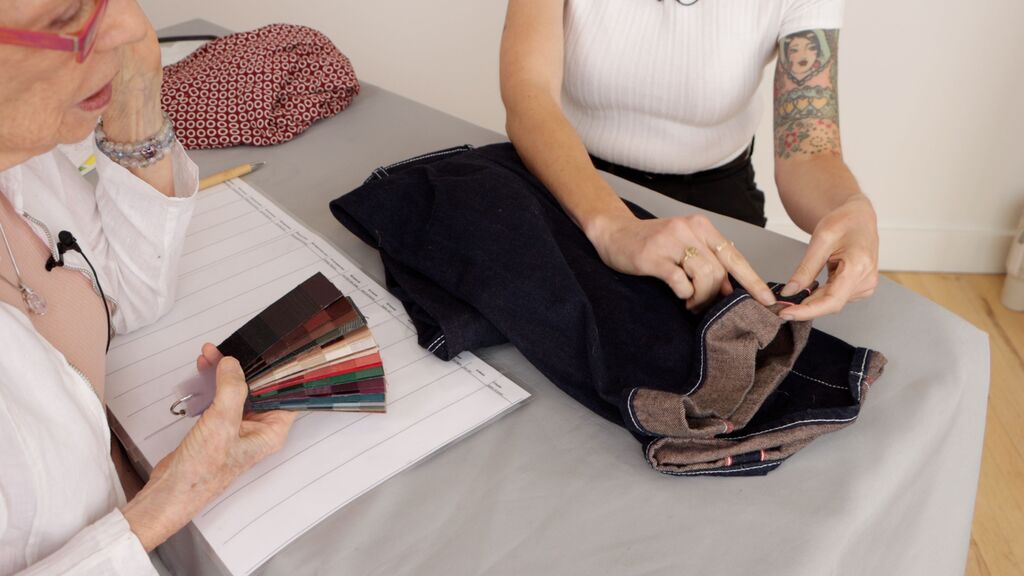
Joy's verdict was that this is a good color for me. It's one I'd almost talked myself out of. But she thought it works better as a neutral than as a statement piece. That's a really useful way to think about denim. It can anchor an outfit so the other colors get to shine.
The Myrna Dress
Next was the Myrna dress I made for Stitchfest, our big annual craft party here in Portland. I love this dress, so I was really curious what Joy would say.
She noticed right away how 1940s the silhouette feels, and she called out its bubbly, spring-ish design energy.
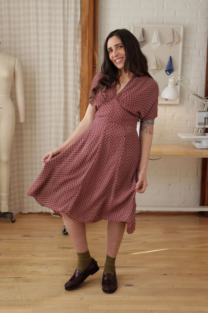
Her verdict: it's the right color family, but the print should go darker. I found that so interesting.
Going Through My Fabric Stash
Finally, I pulled out some fabric I already had. Some pieces were earmarked for future projects. Others I'd been hanging onto for years without knowing what to do with them.
The acid green cardigan fabric. Joy thought this color would fight against my palette. It would only really work if I were playing a winter.
The sapphire blue silk. Joy's reaction to this one made me laugh. "Not a good color for you," she told me, and then added, "It's so pretty, though." Honestly, that's how I feel about it too.
One of my reds. A quick no. It was just too bright.
A coppery, warm brown. This one was a genuine maybe. Joy thought it looked good with my eyes, but not as good with my skin. It's something I could still play with.
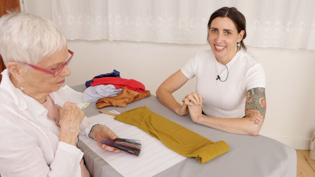
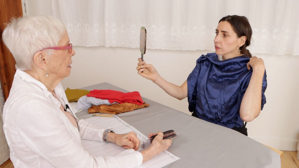
Going through my stash this way was really eye-opening. Some colors were dead on. Some were a stretch I could still see myself making work. And a few, if I'm honest, it's probably time to pass along to someone who will love them.
So, Is Color Analysis Worth It?
One of my favorite parts of my new palette is that it includes colors I don't currently wear at all, like greens and purples. That gives me room to stretch and try something new, which is exactly what keeps sewing exciting for me.
I've always been drawn to certain colors without stopping to ask why. Now I have a real way to think it through, instead of just going with my gut.
To me, that's the real value of getting a second opinion on color like this. I'm not interested in hard and fast rules I have to stick to. I don't think there's much fun in that.
But color analysis gives me new ideas to reflect on. It opens up possibilities I hadn't considered, and it helps me see some colors in a new way. It's a thinking and design tool, not a rulebook.
And when you're building a handmade wardrobe, a tool like that is incredibly useful. It helps you shop for fabric with more confidence. It helps you understand why some of your makes get worn constantly while others linger in the closet. And it helps you plan seasons that feel cohesive without feeling rigid.
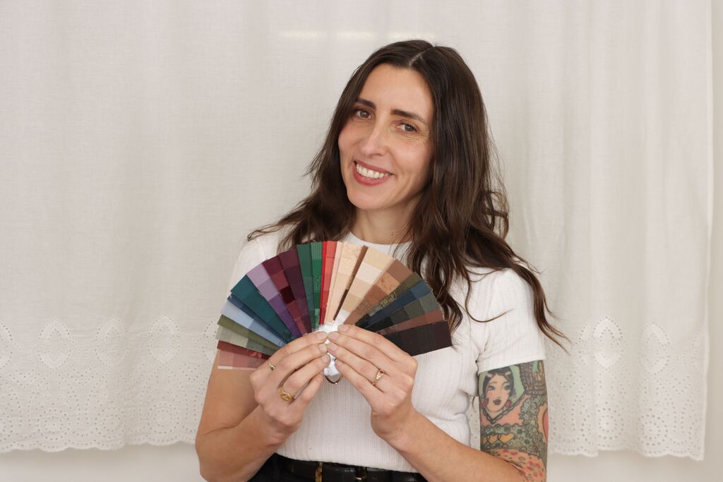
Overall, I love the softness of this palette. It feels like it fits who I am. It's already going to change how I plan my next season, starting with the projects I'll share with you next.
If someone handed you your "true" colors tomorrow, which fabric in your stash would you refuse to give up?
 Related Articles

 Best Articles